Typeface
Forma 36 enables users to create clean and efficient user interfaces.
Geist font family
Forma 36 uses Geist by Vercel as the primary typeface in our font stack to establish a distinct and cohesive visual identity. Inspired by the Swiss design movement, it combines simplicity with excellent legibility. System fonts serve as fallbacks to ensure performance, compatibility, and accessibility.
The Geist font file is served from our CDN at cdn.f36.contentful.com.
Typeface tokens
| Token | CSS Variable | Value | Example |
|---|---|---|---|
| fontStackPrimary | --font-stack-primary | Geist Sans, -apple-system, BlinkMacSystemFont, Segoe UI, Helvetica, Arial, sans-serif, Apple Color Emoji, Segoe UI Emoji, Segoe UI Symbol | Manage content better with infrastructure. It’s the cure for the common CMS. Update once and publish everywhere, so teams build digital products faster. |
| fontStackMonospace | --font-stack-monospace | Geist Mono, SFMono-Regular, Consolas, Liberation Mono, Menlo,monospace | Manage content better with infrastructure. It’s the cure for the common CMS. Update once and publish everywhere, so teams build digital products faster. |
Font sizes
We use rem units to define our font sizes because they are direct and simple to maintain.
What are rem?
rem (root em) are simply a ratio of the root element font size. The root element is the browser default font size 16px. EX: (1rem = 16px) and (2rem = 32px).
Using rem units enables our system to scale up and down based on user preference.
Available Sizes
Section Heading
SectionHeading is intended to be used as a title for a widget, and is most commonly used in the sidebar.
Font size: 12px = 0.75rem - Line Height: 16px = 1rem - Weight: 600
Body
Text is the base component for a body content.
Paragraph is a component that renders Text as p and applies the default margin bottom.
Font size: 14px=0.875rem - Line Height: 20px=1.25rem - Weight: 500
Subheading
Subheadings are intended to be used as headings for copy nested within a section. EX: a subheading under Contact may be Address or Phone number.
Font size: 16px = 1rem - Line Height: 24px = 1.5rem - Weight: 700
Heading
Heading is intended to be used to define a section. Headings are very important for accessibility, as it helps to make copy more easily scannable and guides a user through your content.
Another accessibility consideration screen readers. Visually impaired people often use screen readers, which find sections in your copy based on your heading hierarchy.
Font size: 20px = 1.25rem - Line Height: 32px = 2rem - Weight: 700
Display
Display is intended to be used in the same cases as Display Text Large.
Font size: 24px = 1.5rem - Line Height: 32px = 2rem - Weight: 700
Display Large
Display Large is intended to be used to display text in featured content, such as empty states, promotions, and more.
Avoid using Display Large as a replacement for headings. In these cases, use the Heading style.
Font size: 35px = 2.188rem - Line Height: 44px = 2.75rem - Weight: 700
Font tokens
Font base
| Token | CSS Variable | Value | Example |
|---|---|---|---|
| fontBaseDefault | --font-base-default | 16 | Manage content better with infrastructure. It’s the cure for the common CMS. Update once and publish everywhere, so teams build digital products faster. |
Font sizes
| Token | CSS Variable | Value |
|---|---|---|
| fontSize4Xl | --font-size-4xl | 3rem |
| fontSize3Xl | --font-size-3xl | 2.25rem |
| fontSize2Xl | --font-size-2xl | 1.5rem |
| fontSizeXl | --font-size-xl | 1.25rem |
| fontSizeXlHigh | --font-size-xl-high | 1.125rem |
| fontSizeL | --font-size-l | 1rem |
| fontSizeLHigh | --font-size-l-high | 0.875rem |
| fontSizeM | --font-size-m | 0.875rem |
| fontSizeMHigh | --font-size-m-high | 0.75rem |
| fontSizeS | --font-size-s | 0.75rem |
| fontSizeSHigh | --font-size-s-high | 0.625rem |
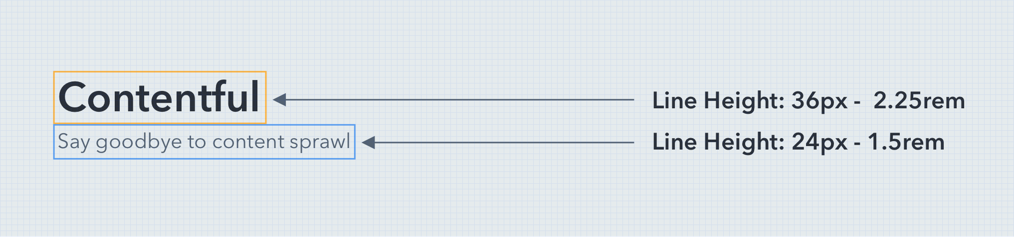
Line height
Line height can be described as a vertical padding around letters on each line.
The Forma 36 line height is defined by rem, which forces the line height to correspond to the root font size.
| Token | CSS Variable | Value | Example |
|---|---|---|---|
| lineHeightDefault | --line-height-default | 1.5 | Manage content better with infrastructure. It’s the cure for the common CMS. Update once and publish everywhere, so teams build digital products faster. |
| lineHeightCondensed | --line-height-condensed | 1.25 | Manage content better with infrastructure. It’s the cure for the common CMS. Update once and publish everywhere, so teams build digital products faster. |
| lineHeight4Xl | --line-height-4xl | 3.5rem | Manage content better with infrastructure. It’s the cure for the common CMS. Update once and publish everywhere, so teams build digital products faster. |
| lineHeight3Xl | --line-height-3xl | 3rem | Manage content better with infrastructure. It’s the cure for the common CMS. Update once and publish everywhere, so teams build digital products faster. |
| lineHeight2Xl | --line-height-2xl | 2.25rem | Manage content better with infrastructure. It’s the cure for the common CMS. Update once and publish everywhere, so teams build digital products faster. |
| lineHeightXl | --line-height-xl | 2rem | Manage content better with infrastructure. It’s the cure for the common CMS. Update once and publish everywhere, so teams build digital products faster. |
| lineHeightXlHigh | --line-height-xl-high | 1.5rem | Manage content better with infrastructure. It’s the cure for the common CMS. Update once and publish everywhere, so teams build digital products faster. |
| lineHeightL | --line-height-l | 1.5rem | Manage content better with infrastructure. It’s the cure for the common CMS. Update once and publish everywhere, so teams build digital products faster. |
| lineHeightLHigh | --line-height-l-high | 1.25rem | Manage content better with infrastructure. It’s the cure for the common CMS. Update once and publish everywhere, so teams build digital products faster. |
| lineHeightM | --line-height-m | 1.25rem | Manage content better with infrastructure. It’s the cure for the common CMS. Update once and publish everywhere, so teams build digital products faster. |
| lineHeightMHigh | --line-height-m-high | 1rem | Manage content better with infrastructure. It’s the cure for the common CMS. Update once and publish everywhere, so teams build digital products faster. |
| lineHeightS | --line-height-s | 1rem | Manage content better with infrastructure. It’s the cure for the common CMS. Update once and publish everywhere, so teams build digital products faster. |
| lineHeightSHigh | --line-height-s-high | 0.75rem | Manage content better with infrastructure. It’s the cure for the common CMS. Update once and publish everywhere, so teams build digital products faster. |
Consistency
To ensure each typeface is represented properly and the customer experience stays the same across different devices.
The base line grid assures that the Forma 36 typography system adapts flawlessly when typefaces, sizes, and weights are stacked together.
Font weights
| Token | CSS Variable | Value | Example |
|---|---|---|---|
| fontWeightNormal | --font-weight-normal | 400 | Manage content better with infrastructure. It’s the cure for the common CMS. Update once and publish everywhere, so teams build digital products faster. |
| fontWeightMedium | --font-weight-medium | 500 | Manage content better with infrastructure. It’s the cure for the common CMS. Update once and publish everywhere, so teams build digital products faster. |
| fontWeightDemiBold | --font-weight-demi-bold | 600 | Manage content better with infrastructure. It’s the cure for the common CMS. Update once and publish everywhere, so teams build digital products faster. |
Letter-spacing
| Token | CSS Variable | Value | Example |
|---|---|---|---|
| letterSpacingDefault | --letter-spacing-default | 0rem | Contentful |
| letterSpacingWide | --letter-spacing-wide | 0.1rem | Contentful |
Guidelines
Go ahead and explore how to use Typography components:
Use Forma 36 Sizes
To ensure consistency across user interfaces utilizing the Forma 36 design system, use available text styles from the Figma UI kit.
Color Contrast
WCAG 2.1 Contrast Guideline recommends to have at least 4.5:1 contrast between your text color, and the background. Low color contrast may result indistinguishable elements on your screen, especially for people with color blindness.